Related Links: NLC | Contact | Blogroll | Feed |


"You Two! We're at the end of the universe, eh. Right at the edge of knowledge itself. And you're busy... blogging!"
— The Doctor, Utopia


Tuesday, November 04, 2008

Now there's an idea

For a few years now I've been on the record as believing that before we completely ditch Dewey or another standard library organizational scheme maybe we should try something a little more simple. For example, just putting up better signage in the library. And, now I've got a patron who, knowingly or not, is on my side. VCU Libraries Library Suggestion Blog recently posted the following suggestion:

For students browsing for books, I suggest the library put up book categories/subject titles on the ends of each bookcase, below the call numbers. This can make it significantly easier to find where we are when looking for books in the library -- after all, we process words much faster than alphanumeric call numbers. Thank you!
From: an undergraduate student

Since it's so short I'll repost the complete response here:

Patricia Selinger, Head, Preservation Department, VCU Libraries, responds...
Thank you for this great suggestion! The Preservation Department is responsible for maintaining the call number guides throughout the stacks. With our stacks overcrowded, we shift collections regularly to make room for new materials. The call number guides become obsolete quickly in this environment. We haven't had subject guides before but we are looking at solutions that will help students browse by subject. Look for posters in the near future.

In other words, here's a patron who thinks that just putting a bunch of numbers at the end of an aisle isn't very useful and instead suggests that we use actual words instead, or at least in addition to the numbers. Hey, I bet if you did that, your collection would be instantly more "browseable" without moving, recataloging, and relabeling everything.

But, I still have a question: Admitting that this is based on an assumption on my part but why the heck is the "preservation department" in charge of signage. My assumption is that this department doesn't exactly interact with the library's users with any regularity. Shouldn't those in charge of the signage actually know how the collection is being used via direct observation? Besides, what does directional signage have to do with preservation of the collection anyway? (Maybe you can preserve the collection by making sure no one can find what they're looking for. No use = long-term preservation? ;-)
Labels: ,

Tuesday, July 15, 2008

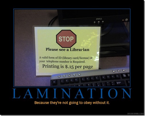
Funny... But, why?

Yes, this is funny:
http://www.flickr.com/photos/jblyberg/2669077928/

But consider the actual sign being criticized. Why is the library asking for your phone number just to use a computer? What possible legitimate purpose is that serving?

Labels: ,

Monday, December 03, 2007

Signage improvements

I've gone on record with regards to my skepticisim about getting rid of Dewey. I believe that before we ditch Dewey (problems and all) completely, maybe we should try better signage. Here's an example of what I'm talking about from Sandy Kallunki, Supervisor, Children's Dept./Adult Fiction Dept./Teen Zone, Brown County Central Library. (Reprinted with her permission.)

As part of a project for making our department more "browser friendly" for people of all ages, reading levels and languages, we are re-doing our children's nonfiction shelf signage.  We are revising our "end of range" lists (signs) to include little images in addition to dewey numbers and the subject names, and then we are putting a matching image and subject name on shelf label holders where the actual books are.  So for instance, the list at the end of one set of shelves includes not just "567 Dinosaurs" but also a little picture of a dinosaur.  Initial reaction from kids and adults has been very positive.

We use the "grip on" shelf label holders from Demco and it is still a bit awkward sliding books over the top part. 

It has been a challenge to find images that kids and adults recognize and that are identifiable when shrunk down small.  Also, we looked for non-copyrighted stuff.  We are happy with most of the images that we've come up with, others less so.

The other tricky part is that this has forced us to look at what Dewey numbers we use to try to be more consistent where possible.  For instance, rather than having Titanic books in two different places (two different call numbers), let's put them all in one spot.

We also plan to use the shelf label holders to identify popular series and authors in our chapter books section.  And we have used them in our children's Spanish section to identify where the different types of Spanish books are--picture books as opposed to nonfiction.  There the challenge is translating the terms we use into Spanish.

In response to my request to reprint her e-mail here she also added:

Our new nonfiction signs/shelf labels are actually part of a 2007 LSTA grant project (almost finished) through which we are setting up a revitalized "Parent/Teacher Center" in our Children's Department as part of a broad-based local Community Partnership for Children. One of the objectives of the grant was to make the entire department easier to "self-navigate" for our very diverse customer base.

I've asked for some photos and hope to share them here in the future.

Labels: ,

Tuesday, November 27, 2007

Looking for new signs for your library

Someone recently said to me that they wished that in their library they could just put up a sign that said "Go ahead and use your cell phone, just don't be an asshat." Well, these signs from ..@the library.. aren't exactly that but they're close.

Labels: , ,